MB
A

Overview:
Time Period:
Role:
Tasked with a hypothetical Full Scale App Development for the Massachusetts Bay Transit Authority (MBTA), our team has developed a new mobile app, CharlieTM. Charlie will offer travelers a more convenient travel experience with the MBTA and its three main transit options - the subway (commonly known as the T), the commuter rail, and the bus.
3 weeks
UX research, wireframe mockups, theme generation, usability testing, final prototype
Approach
For our research we conducted a focus group with the goal of understanding a little bit more about our targeted users. Of those we talked with, one of them is a student, two of them are working professionals, and the other two were family members.
Main take - aways:
-
The T serves as a convenient and cheaper option that works with the location of both their houses and their offices in the city.
-
For infrequent user, the T was easy to meet with friends in the city or get to dinner.
-
The T or bus is a good thought but can often be too big of a hassle to get to/from a T or bus stop and can be too big of a time commitment.
Though we knew going into this discussion that we would be creating a mobile ticket system of some kind, we wanted to hear some feedback on the idea. Everyone seemed to agree that a mobile ticket would be very useful. That way it is harder to loose, more environmentally friendly, and much easier to access instead of digging through your wallet trying to find a Charlie Card.
User desired features:
-
Easy-to-access map of the subway or commuter rail system
-
Accessible map so users can plan their route or remind themselves of station names
-
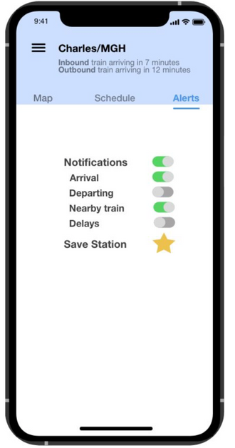
Notifications
-
Location sharing
-
Mobile Charlie Card
Initial Wireframes and Usability Testing
With this we conducted usability tests to determine the strengths and weaknesses of our prototype and revisions for the next prototype. Check out a full write-up on the findings here.
Moodboards

Moodboard 1
This moodboard depicts a colorful approach for the MBTA transportation app. Boston's T already features plenty of color with the Red, Orange, Green, and Blue lines, and this theme highlights this. The primary colors of the theme would be white, wiht accenting greem orange, blue, and green. It would also feature modern illustrations that would make the users feel like they are using an app that ws carefully and beautifully designed for them rather than just another bland transit app. The font for this theme is PT Sans Caption - simple, yet mathces the modern design- heavy theme.
Moodboard 2

For this theme, we took a more monochromatic approach. Sticking with black, white, and dark blue, this allows for accent colors to show. This development concept is little different from the currently colorful designs and feel of the MBTA. Though different, this design leans towars a more sophisticated feel though fun icons and clean lines.
We decided to move forward with this moodboard because it allowed us to use the specific train line colors as accents within the app
Final Mockup
Click here to see the high fidelity, clickable prototype.
Meet the Team

Olivia Wentzell
Tufts University 2020

Greg Callahan
Tufts University 2020

Emai Lai
Tufts University 2020

Dylan Daisey
Tufts University 2021


